25 Must Have Pages For Your e-Commerce Website
Previously, we have discussed the 13 pages your company must have. Today, let us have a look at the eCommerce website.
The most essential pages for any eCommerce website are the home page, product page, shopping cart, and checkout.
However, there are many other important pages that are often overlooked.
Our eCommerce experts have put together a master list of 25 must-have pages for any eCommerce website. These pages are essential for providing a great user experience, increasing conversion rates, and generating sales.
1. Homepage
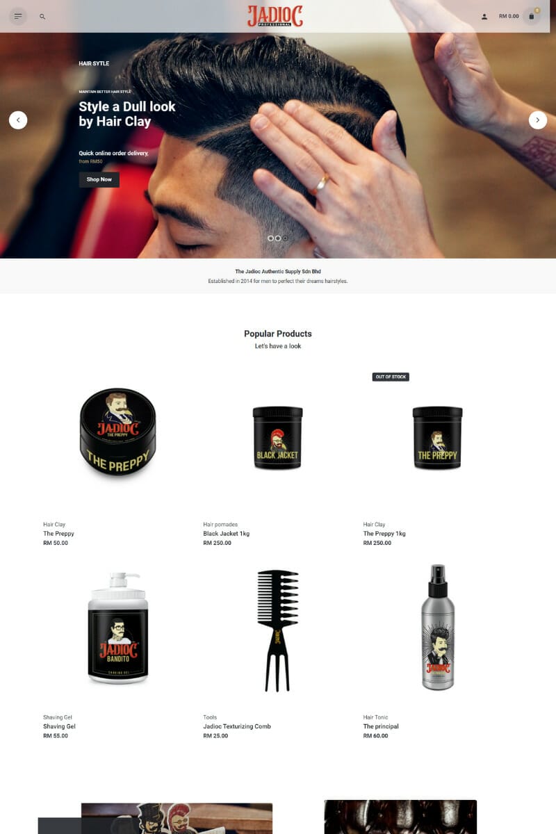
The homepage is one of the most important pages on a website. It’s often the first page that visitors see, and it’s a great opportunity to make a good first impression.
Your homepage should include promotions, branded images, and featured products or categories. Value propositions should be clear, and any brand guarantees (like free shipping) should be prominently displayed.
However, keep in mind that people don’t always enter websites through the homepage. They might arrive via direct links to other pages. Therefore, it is important to make sure that all other pages on the site are just as compelling as the homepage.
2. Category Overview
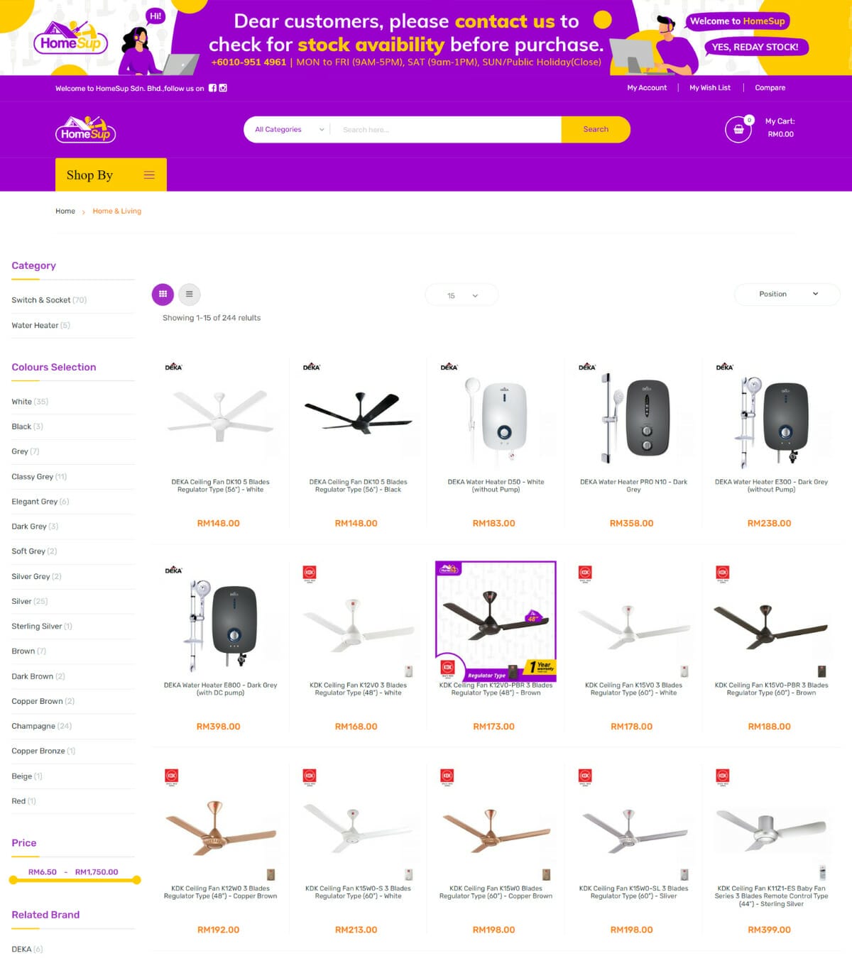
Categories often have a hierarchical structure, where the parent category is at the top of the hierarchy and child categories are nested beneath it. This allows website users to drill down to find the specific content they are looking for.
For example, an online apparel store might have a parent category like “Men’s Shirts” with “Men’s Denim Shirts” as a subcategory. Under that subcategory, there might be several more child pages featuring different sizes, colours, and styles of shirts.
As the user moves from the homepage to a category page, the URL structure will display the hierarchical structure in descending order from left to right.
3. Category Page
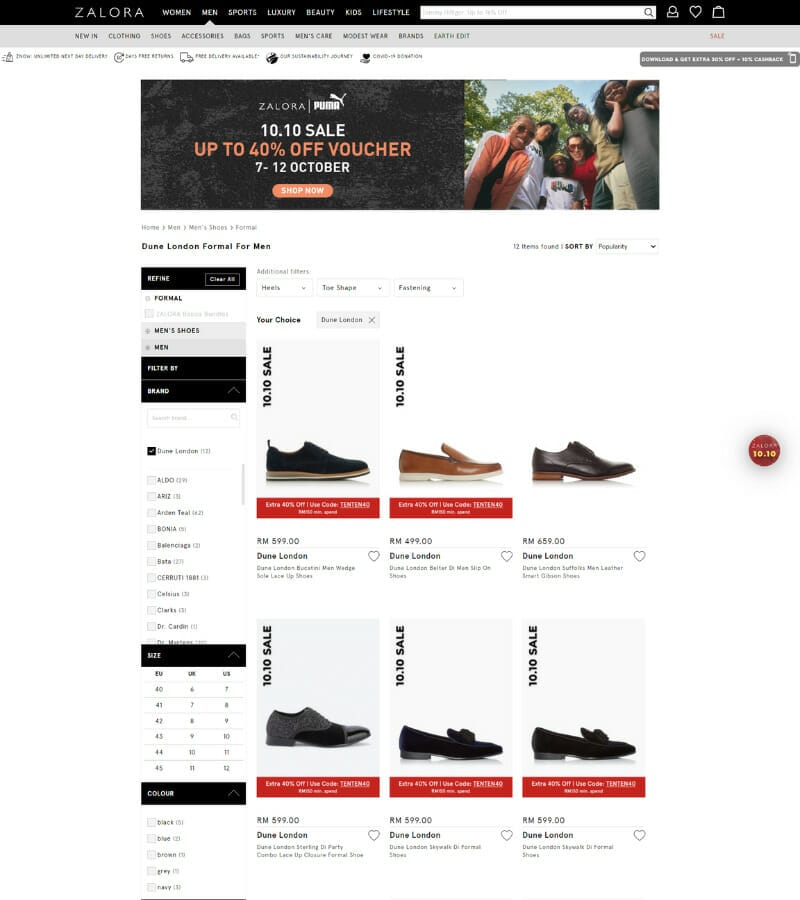
The Category page is the list view of products for a specific category or subcategory, usually displayed in a grid layout. It often includes filters so the user can drill down and find what they are looking for.
The focus of this page is for the user to browse and see a lot of products at once, compared to the Category Overview which focuses on promotion and wayfinding. This page is the perfect place to browse through products and find what you are looking for.
4. Product Page
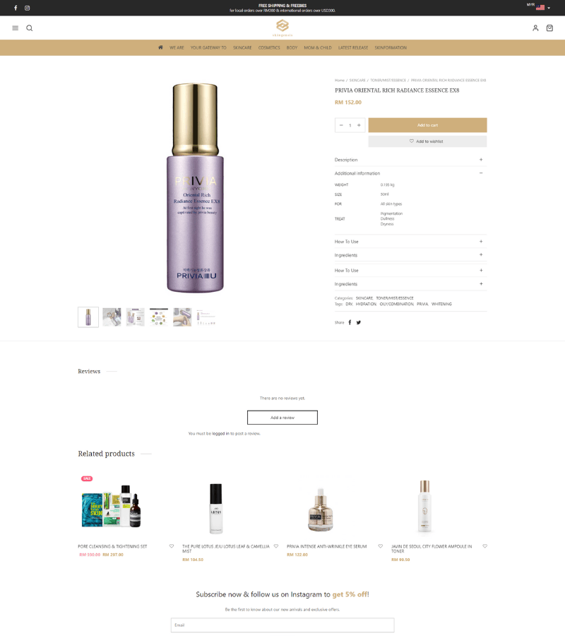
Product detail pages are where customers can learn all about a product before they purchase it. Be sure to include all the relevant details, such as pricing, product features, and customer reviews.
Adding related products and user-generated content from social media can help drive customers to add the product to their cart.
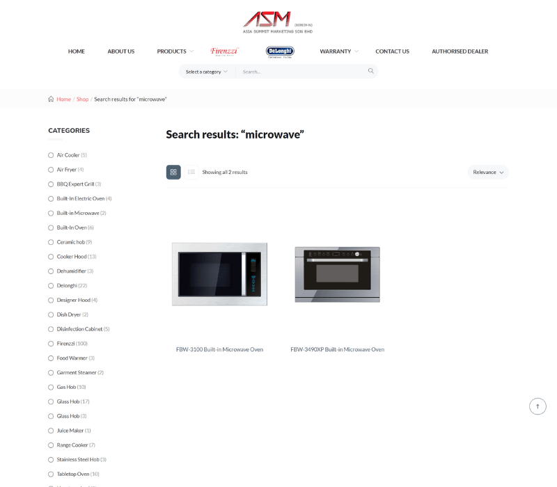
5. Search & Search Results
Search functionality is a must for eCommerce sites, especially those with a large inventory. The search field is typically located in the navigation menu.
When designing the Results page, keep in mind how users will interact with the results. This page usually follows the Category Page template; however, it could also have its own unique design. Suggested search is a great way to surface products while the customer is typing, which eliminates the need to go to a dedicated search results page.
6. Login/Create Account
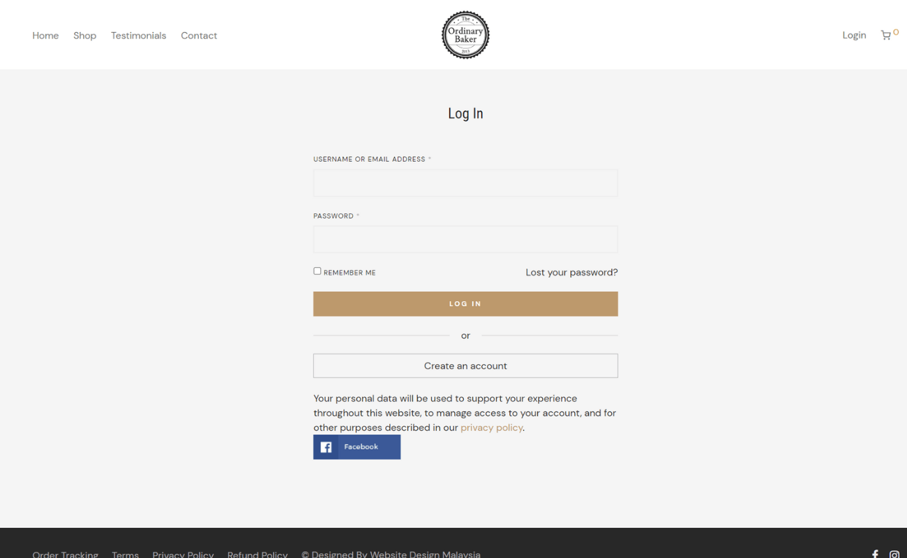
Log in/Create account functionality on eCommerce sites allows customers to save data for future use, such as order history and payment information. This can also enable other interactions, such as wish list management, the accrual of rewards/loyalty points, and special access to deals.
The login/create account form can be found on its own page or be treated as a modal or dropdown. Creating an account should be accessible from the login fields (and vice versa), so users can easily get to the Create Account page if they realize they don’t have a login.
7. Mini Cart
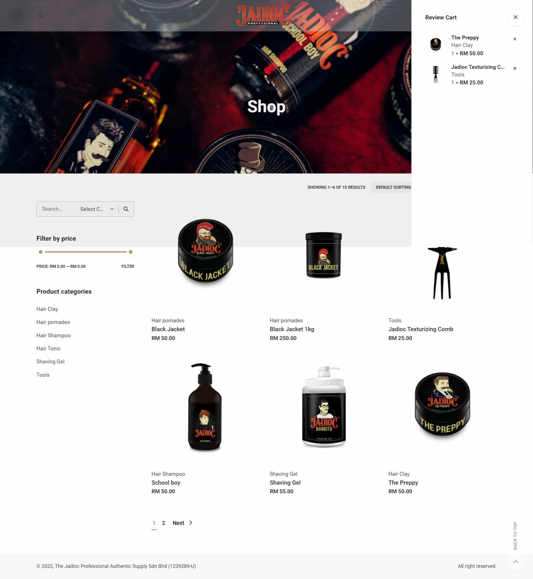
The mini cart is a must-have for any eCommerce site. It’s a great way to provide visual feedback to the user when they add an item to their cart.
It is often in the form of a dropdown or flyout coming from the cart icon in the nav, or a modal on the page. The mini cart should be informative, recap what was added, and update the cart subtotal.
This is also a great opportunity to get the user to keep shopping by showing how close they are to free shipping and presenting related products.
8. Cart Page
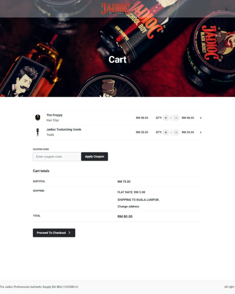
The shopping cart needs to list everything the user has added and have the ability for the user to make changes. It’s good practice to show the estimated shipping cost and the promo code field at this point so the user can get a good idea of their final cost without going too deep into the checkout process.
This way, abandonments won’t happen on the last step of the checkout when customers discover the cost of taxes and shipping, and that their promo code doesn’t work.
Upselling related products can also happen on the cart page.
9. Log In/Guest Checkout
After a user reviews their cart and sees that they are not logged in, it is the perfect moment to prompt them to either login or checkout as a guest.
Logging in will provide the user with a quicker checkout experience by using the saved information. Checking out as a guest will require the user to fill out all their information.
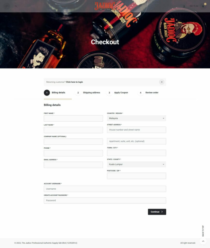
10. Shipping
The shipping page should contain all the necessary form fields to collect the shipping address. It is common to have a checkbox to use the same shipping address for billing purposes.
11. Payment
The payment step includes form fields to allow shoppers to input their payment information. Remember to include the fields to enter a billing address in case it’s different from the shipping address.
You may also include the option to allow the shoppers to enter gift cards, rewards points, promo codes or any rewards or store credits.
12. Checkout Review
It’s an important step for your shoppers to review all the items that are purchased, the shipping info, payment method, discounts, and extra charges like taxes or shipping costs.
Make sure the details are listed clearly with the main call to action used to submit the order.
13. Order Confirmation
After the customer submits their order, they will see a thank you message and confirmation that their order was successfully submitted.
The order details and info on how to modify the order will be displayed, in case the user catches a mistake after submission.
If this was a guest checkout, the user will be prompted to create an account to save all the information that they just submitted.
14. My Orders/Order History
This page lists the current orders and also all the past orders. So, the users can refer easily.
15. Individual Order View
This is the order summary page with shoppers’ receipts for the purchase they just made. It includes all the details of shoppers’ purchases, from what they bought to where they shipped.
If your eCommerce platform is integrated with shipping and fulfilment software, shoppers may also find a tracking number for their orders.
16. My Profile/Account Settings
The “My Profile” page is where customers can manage their account settings and information. This page usually includes fields for name, email, and password details, as well as any additional information that the customer has provided. For example, many companies include demographic information on this page.
This is also typically where customers can access their Wishlist items. Most companies incentivize account sign-ups by only allowing customers to save items to a Wishlist if they have an account.
This page is also a good place to provide details about rewards and loyalty programs, such as the customer’s rewards balance, how to earn rewards, and how to apply rewards to an order.
17. Payment Settings
The Payment Settings (or Manage Payment) page lists saved payment info (gathered from previous orders), and gives customers the ability to update or delete that information.
18. Addresses
The Addresses page lists all of the saved shipping addresses, allowing users to update or delete them as needed. If you have different branches in the country, you are encouraged to install store locator plugins into your website to easier your customers.
19. Email & SMS Sign Up
Email and SMS are two of the most important tools you can use to keep your eCommerce business running smoothly. By providing easy ways for customers and prospective customers to sign up for your email and SMS messages, you can ensure that your business will continue to thrive.
Make sure that you provide an incentive for signing up, such as a free shipping discount, and be sure to give a short overview of the types of messages that subscribers will be receiving.
Also, don’t forget to include a confirmation message after someone submits their information. This message can be its own page or it can be loaded into the modal/footer area.
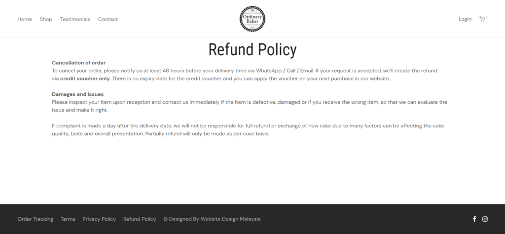
20. Returns
Returns are an important part of shopping online. A clear link to the returns page should always be included in the footer so that customers can easily find it. The returns page should also be accessible during the checkout process, in case a customer has any questions or concerns about the policy.
The best return pages are easy to understand and address common questions and concerns. They should lay out the return/exchange process in a clear and concise way.
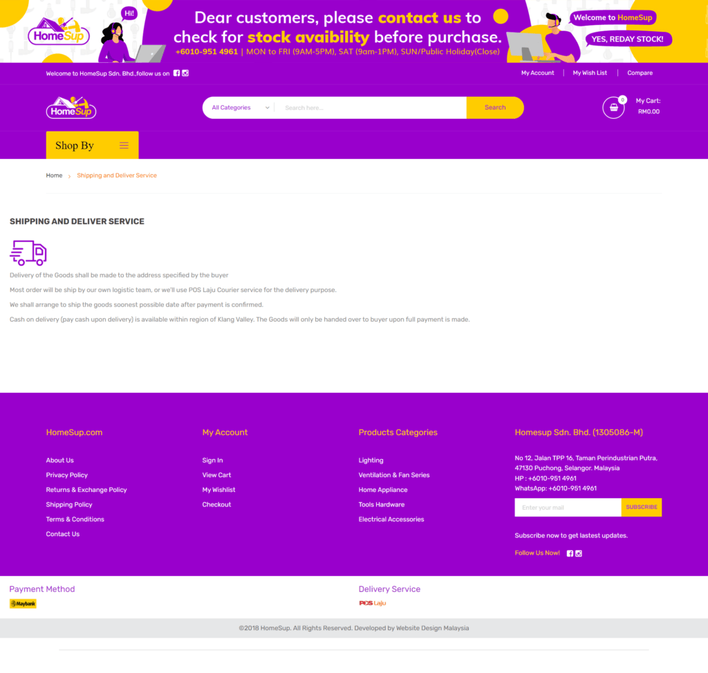
21. Shipping
A big question on shoppers’ minds is how long shipping will take and how much it will cost. An easy-to-find shipping information page (often in the footer, like returns) is essential. Include information about international shipping policies and any special holiday shipping schedules.
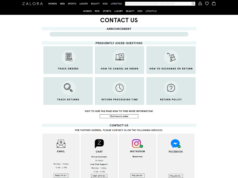
22. Help/Contact Us
Make sure your customers can easily find ways to get in touch with customer support. Whether it’s an email address, phone number, form, or live chat, make sure it’s all in one place on a Help or Contact Us page.
This will make it quicker and easier for customers to get the answers they need, and it will show that you’re committed to providing excellent customer service.
23. Store Locator/Where To Buy
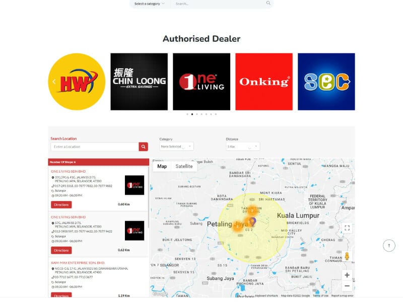
When you have physical store locations, some visitors will come to your site primarily to find a store near them. Likewise, if your brand’s products are sold by other retailers, it’s important to provide a page on your site for users to find who stocks the brand and where they can go buy it.
By doing so, you’ll improve the user experience on your site and increase the chances that visitors will take the desired action.
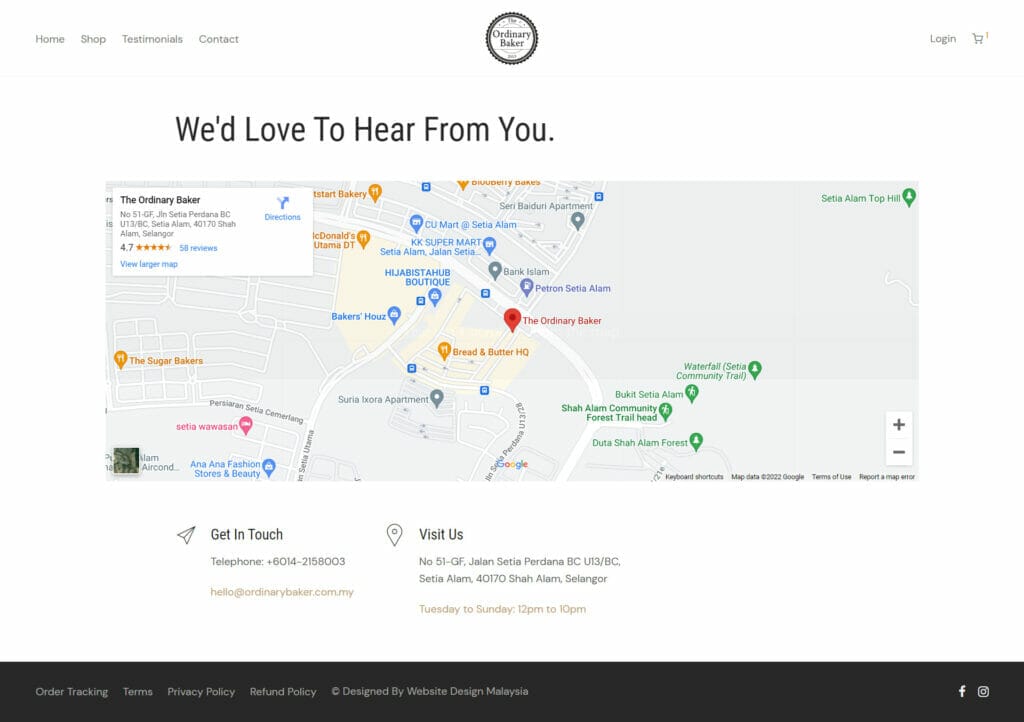
24. Store Details Page
Provide full details such as map, contact numbers and business hours for each of the particular stores you have.
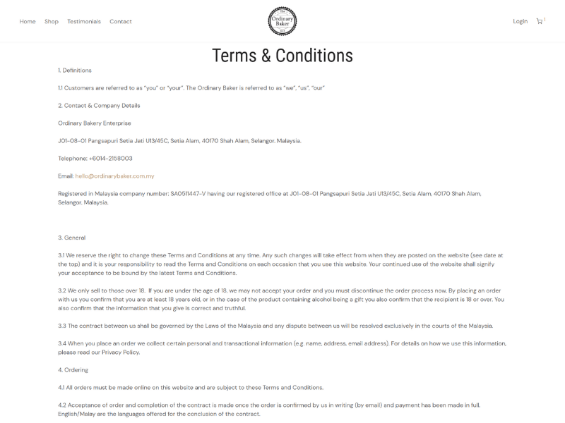
25. Terms & Conditions, Privacy Policy and Web Accessibility Policy
As with all sites, don’t forget to include the legalese. If your site is compliant, it is important to include an accessibility statement.
This statement serves as an acknowledgement and commitment to accessibility, provides customers with information about the accessibility of the company’s content, and shows customers that your business cares about them.
Conclusion
The list above covers everything that’s needed on a core level for an eCommerce site, but depending on the type of products sold and the unique goals of the brand and store, more pages and features may be necessary.
These could include an About page, Blog, Wish Lists, Careers page, and more.
Need more assistance? Contact us today – Web Design Malaysia


